


JohnnyRocket
Members
-
Joined
-
Last visited
Everything posted by JohnnyRocket
-
Fearless Valley, everyone
-
Yes on the pre-season VIP tour with Russ, he said had the project been planned by “current” Merlin there would have been more theming.
-
I personally think it’s a shame it’s not themed. The main appeal is obviously the size but just think back to when Colossus was built - the appeal then too was the size and the 10 loops, it could easily have been left with a tin shed station, a concrete pit etc a la Sik at Flamingoland. And same again for Stealth, its main selling point was the height and launch. The minimal 1950s American drag race theming elevates it from what could have been just a plonked generic white coaster. Hyperia will be standing for the next 30+ years, I think it’s a wasted opportunity to build something that looks so bland and generic (and possibly even ugly with its cigarette butt supports). Once the hype dies down, we’ll be left with an unthemed coaster into the 2050s in a park that clearly does value theming, as we’ve seen what they’ve added to Colossus and Stealth this year. Even the newly refurbished toilets this year are themed more than Hyperia! I just think it’s the long term vision for the park that has been let down with this project.
-
Just needs the one on the arm putting back on now, which only seems to be on 10% of the time
-
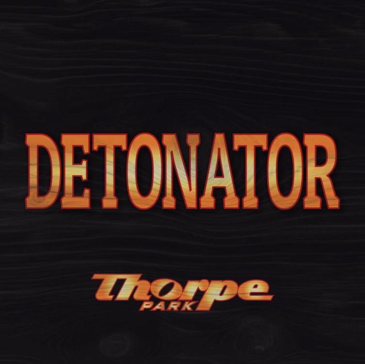
Is the soundtrack still the same? The loading and main Matrix Reloaded track. I do genuinely love that Thorpe’s rides have been playing the same music for 20+ years. The only casualty we’ve had is Detonator.
-
Yeah it did always stylistically fit in with Lost City, I think they’re sort of trying to fit it in more with Saw now. It’s lumped together with Saw on the map and signage now. So the black is a bit more fitting. Always been an awkward junction of themes there anyway.
-
It does suit its original Chessington scheme much better, as much as I liked the Lost City blue on it. Funny how it now actually matches its logo.
-
It's a shame they didn't just have one big single-direction queue looping round the back of the ride and lake, rather than a tight cattle pen squeezed in at the front.
-
Wow, that’s very poor. That means zero rides operating in Mexicana or Land of the Tiger on off peak days. Tiger Rock looks grim when it’s closed.
-
I don't know, it just comes across as an internal battle between some people wanting themed areas and others not. So the compromise was not giving the areas names but just grouping the rides into colours, which is totally meaningless to guests. 🤷♂️ Like, it means nothing that they've lumped the playground in with the dome shops. And they're lumping Walking Dead with Ghost Train but have made sure the new Fish & Chip stand is listed as Amity, even though it's between Walking Dead and Ghost Train, so what's the point? I think either go hard on the themed areas or not at all. Maybe that's just me! Ultimately it doesn't really matter of course, just a curious decision.
-
Haha of all the years the re-brand Vibes again, you'd think this would be the one! 😅 Yeah presumably something fireworks related being added to Detonator - when you think about it, it's a firework in reverse as the ride's shooting downwards - maybe it'll be a firework test going wrong?!
-
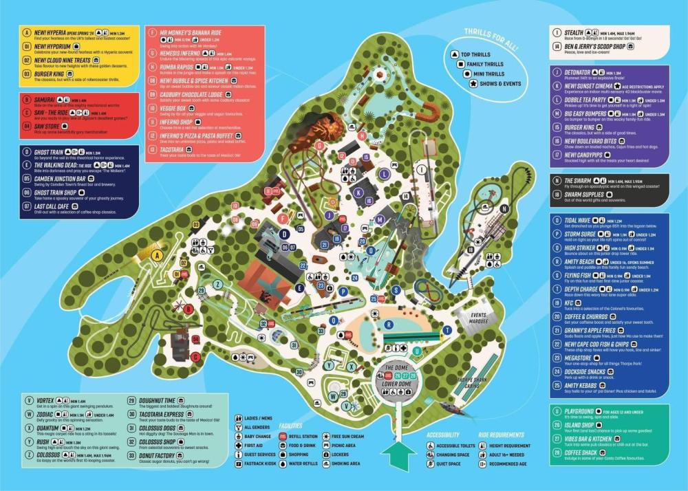
Wasn’t sure whether to start a 2024 topic or one just for the map. In any case…. The 2024 map has been released. 2 main observations from me. One - seems strange to build the UK’s tallest coaster but opt for your map to be a 2D top-down view meaning you don’t see the height of the new ride. Two - they’ve very clearly put defined areas back on the map again here, but haven’t put area names on. This seems really weird?! Either commit to the themed areas or don’t have any at all. I think it makes the layout confusing as to the average guest there’s no rhyme or reason why certain rides and shops are grouped together. In any case, Samurai and Saw now constitute one area, hence the black repaint it’s getting. The teacups are considered part of Big Easy Boulevard. https://www.facebook.com/share/x3SLLY1onbm1F8ZR/?mibextid=WC7FNe
-
Ahhh there's even more new adverts round Stealth! I love them all! Depth Charge diving school. Love it. And the Amity Hotel with shark room. Amazing how much difference just adding some art to some blank fences makes
-
Interesting! I always liked Colossus's entrance, was more impressive than Inferno's, Swarm's & Saw's. Can never say no to extra theming though!
-
It does genuinely look better than when it opened! I do wish they would bring back the broadcast van/trailer even just as theming. And I miss the original diner!
-
I think Detonator looks alright to be honest, it's always just been a tarted up temporary funfair ride at the end of the day. Once the whole area's done, it'll be the most cohesive that part of the park has ever been, it spent a lot of its time being a mashup of pirates and 1950s America, then the dodgy Angry Birds IP plastered over it slap bang in the middle of Amity Cove.
-
Are you able to share for those of us not annual pass holders at all? 🙃
-
The memorial was moved to Sunken Garden before works started!
-
New logo for Detonator https://www.instagram.com/p/C3YJ3tFxGZF/?igsh=MWk5aG5wcDljcTRoag==
-
Yep no surprise or great loss if it has gone, it’s a great space for a Fright Nights maze
-
Good if so! Was fun when it opened but it’s a one-and-done kind of thing. Much better space for a Fright Nights maze
-
From Jack Silkstone, Amity Cove is finally being decluttered round the front of Tidal Wave! Amazing news.
-
Not really people pouring their heart out over it? It’s an end of year round up over the course of 2023 of different rebrands. I’ve personally got used to it, but it’s still ultimately a crap logo. And that’s what this thread is dedicated to. The park hasn’t even opened its doors yet following the new rebrand!
-
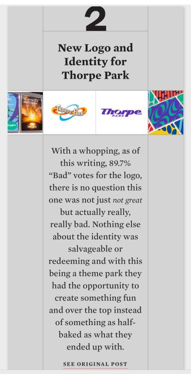
A global rebrand review blog has now named Thorpe Park’s the 2nd worst of 2023. Behind a paywall, but a summary: Original link: https://www.underconsideration.com/brandnew/archives/the_year_in_review_part_3_the_most_not_great_2023.php
-
Quite fun that we still don’t know what the new 4D film will be. Perhaps the generic cinema theme points towards it not being a specially made film, as you’d think they’d go all out for that. So perhaps it’s a film that already exists at other parks, as Pirates 4D was. Anything out there that Thorpe might buy in? Or maybe it will be a specially made film!


