-
2026 Season
As tends to be the case most years as theme park enthusiasts always tend to don their detective caps in closed-season boredom, there's rumba-lings that Rumba Rapids may be on its way out this year. As I said, this rumour always tends to circle back around every year but to be fair it doesn't look like much has happened over there this closed season, with the boats allegedly still sitting deconstructed along the Monks Walk access road. Although the ride itself is pretty dire nowadays and I wouldn't batter an eyelid at seeing it removed, it will be bittersweet in a way that water rides in this country seem to be a dying breed now. I used to love water rides and especially rapids rides as a kid, and now to see parks getting rid of their water rides mostly due to the influx of red tape to keep them operating and as a result the running costs being higher than they've ever been, I can totally understand why the parks are putting them on the chopping block - especially with the looming threat of Universal opening in a mere 5 years time, I'm sure the parks will be looking at investing at breakneck speed to ensure they can compete. The question, however, remains as to what to do with that land - and I really hope that if the rumours are true (they're probably not, let's be real), that the park already has some idea as to what they want to do with it to get the plans in motion to get started with as soon as the closure is announced. I hate nothing more than seeing rides SBNO and left to rot - and I hate it even moreso at a smaller park like Thorpe. I know a lot of people would probably say they would prefer a new coaster where Rumba is - and another new coaster behind Swarm Island in a few years time - but personally I'd love for them to utilise both at the same time. Not to open two coasters at the same time, but to finally push the boat out and have one long, drawn out coaster spanning across the two areas. Understandably cashflow issues are probably the biggest hinderance here, but again with Universal now only just round the corner really - taking the plunge into a big coaster would probably be a good shout. I'm pretty vocal about how I think an RMC is the best fit for the park (and I stand by that), but let's be real - it's very unlikely. New attractions at Thorpe haven't exactly been the biggest success in recent years (DBGT being a large commercial failure, Black Mirror being a low-budget maze that nobody really cared about, Hyperia's extended downtime from day 2 and its plethora of valleys), and taking the plunge with another manufacturer who the people in ties at Merlin corporate may consider to be inexperienced would be a massive gamble and in their eyes yet another potential commercial failure if things go wrong. An RMC would be great for the general public and enthusiasts alike, but would mostly just be seen as fan service for all the enthusiasts asking for one over the years. What's more likely I think is an Intamin multilaunch. A fast, drawn out Taron-style coaster would also be bloody brilliant for Thorpe. Yes, they've already got their launch coaster with Stealth, but let's be real (as much as I hate to admit it) hydraulic launch coasters aren't going to be around for much longer and as a result the park needs to start preparing for what to do when that time comes. I'm not saying this coaster should be Stealth's immediate replacement - because I think it still has the legs to be around for a fair whack longer at the moment - but if the park don't already have a launched coaster replacement for when the time comes, Stealth's lack of presence at the park will be felt massively. I also really wouldn't mind if Rumba got scrapped and a coaster didn't replace it at all - I've always said that I found it insane that the best water ride in the country is in the arse end of Blackpool. A 9+ hour roundtrip for me - so is therefore one that costs me a fortune in fuel and a hotel stay (in a town that in all honesty I would rather get away from as quickly as possible and not have to stay overnight in). If we could get an indoor water ride to the kind of level of insanity as Valhalla down south, I would forever be in debt to the Thorpe overlords. That would then keep the plot of land used to previously occupy a water ride... occupying a water ride... and could then therefore keep the island behind The Swarm free for a new coaster as has been rumoured for like 13 years at this point. I'm getting a little carried away here, but the bottom line is that whether or not Rumba returns this year - its time is well and truly up. Other than using it as a place to rest my legs on a warm summers day at the park, getting sent around multiple times without getting off because there's no queue... it's just a big, slow, boring, expensive waste of space. They could spend money trying to do it up to make it more interesting, but that would only be polishing a turd at this point. I truly do hope that Rumba is next on the chopping block.
-
-
-
-
Ghost Train - NEW for 2023
Wouldn't even remotely be surprised if this was the outcome (even as potentially one of Ghost Train's very few genuine fans) - I think its days were numbered when they stopped running the fakeout finale and just chucked ride staff in front of it to guide guests in the other direction instead of bringing it back or at the very least redecorating the fakeout finale room to be something different so that the original exit route is retained even if the fakeout was cut. I said at the start of the season that I reckon Ghost Train had maybe 2 seasons left in it at most. I will genuinely be sad to see it go - but even more so if it goes without a plan for its future. It may be a bad attraction on paper, but I'd rather take something rather than nothing any day of the week. I just hope that whatever comes next isn't a demolishment of the building and another coaster built there. Thorpe are crying out for a good dark ride - I love the Ghost Train building and is definitely sizeable enough to fit something else in there - the only issue would be getting the motion platform out and the new ride system in. There's many more much more appropriate locations for a new coaster when the time comes. For the love of Christ keep it as a dark ride, but do it more traditionally this time. I'd love to have seen how DBGT could've gone if it weren't for the VR gimmick and Derren had been given full creative control...
-
-
-
-
Hyperia
I was actually thinking just the other day if Hyperia had a different post-breakdown ritual, becuase come to think of it I don't think I've ever (or if I have, it's probably literally only been one train) seen empty trains go round the track after a breakdown. The question of how Thorpe could fix the reliability issue is one that really interests me - LSMs where the trim brackets are is the most obvious answer to me, but I'm not sure how possible that would be to retrofit LSMs into a bracket not intended for LSMs and that's not even taking into consideration the fact that the trains probably aren't capable of utilising LSMs, which would mean yet ANOTHER retrofit which would likely cause a whole other stream of problems. Realistically, shortening the height of the outerbank inversion thing is probably easiest and would have the least amount of moving parts... but also can't really see the park opting for this either. I just reckon it will continue to be operated the way it is at the minute pretty much indefinitely - it's a pain in the arse, but at least it somewhat gets the job done without costing the park any extra money.
-
Ghost Train - NEW for 2023
I wonder if we'll see a return of the gift shop this season... I'm not holding out hope.
-
-
-
Fright Nights 2024
I was at a Ghost Train behind the scenes tour last Tuesday with the initial presentation taking place in the hospitality tent thing - Fright Nights rehearsals were taking place next door and they were definitely rehearsing to the Big Top theme which I believe is used in the Big Top room in Trailers, so that seems to suggest it'll return this year. Hoping that the scenes that remain inside Trailers are modified in some way too - Trailers was really showing signs of aging last year and was looking really, really exhausted.
-
-
-
Park Operations
Best part of Oktoberfest at Thorpe for me has always been the ride audio overlays and the Oktoberfest Thorpe theme (which we have now lost). A real shame because one of my first ever Thorpe trips (I'm a newbie in comparison to lots of others here) was during Oktoberfest and I bloody loved it and would even go as far as saying it was my favourite event. Little to no crowds, catchy soundtrack, beer... what's not to love?! I'm going to the park tomorrow to experience it, but judging by here and social media it is a shame to see that they have lost their touch with Oktoberfest this year. I wouldn't be opposed to bringing back the old Oktoberfest theme... we all know how much Thorpe love a 'nod to the past'!
-
-
-
-
-
-
Hyperia Speculation and Construction Thread
this project has turned out to be one questionable decision after the other to be honest - don't get me wrong - I absolutely cannot wait to ride - but everything from the station building, planned landscaping, lack of a viewing platform, queueline etc has been pretty disapponting thus far. I also personally find thorpe's generous (putting that lightly) overuse of the gold colour super tacky. if it was used as a highlight colour against a black station, it would look so much more elegant. also a little confused by the black and gold colourscheme of the station, queue etc but the actual coaster itself is white and gold? wouldn't a white and gold station have fit the aesthetic better than a black and gold one..?
-
New Logo Discussion
Yeah that's definitely a stylistic choice, I personally don't mind it... well, as much as somebody who still doesn't really like the new logo can 'not mind' something. The new logo has definitely grown on me though, my opinion of it now is 'it's okay'. I still think the old one suited the tone of the park better and they'd have been better off keeping the infinity rings but just changing the comic sans logo, but alas the new Dafont logo is seemingly here to stay!
-
Hyperia Speculation and Construction Thread
Would be a different scenario if they were designed to get riders wet, but we know in all likelihood the water won't as much as graze the riders. Can't help but feel like Thorpe have made a lot of questionable decisions throughout this build process - but ultimately, as long as it rides nicely I'm happy enough.
-
Rocky Express
Don't suppose anybody knows if Rocky Express is coming back, do they?
-
Hyperia Speculation and Construction Thread
Really, REALLY silly decision in my opinion. Likely been cut because of time (and possibly budget, considering they weren't originally planning on rebuilding the shop from the ground up - so that must've been a bit of a spanner in the works), but it really would've made the area something special. People were vocal about a lack of supporting ride in the area, but I always dismissed it as I thought the viewing area would've compensated for it nicely - something extra to do, and something nice for those that aren't wanting to ride but wanting to keep an eye out for their friends/family etc. The area isn't going to look bare with a massive 236ft rollercoaster in it by any means, but it certainly isn't going to be the majestic, elegant land that was initially proposed in the plans now. Bitterly disappointed by this decision, I'm not gonna lie.
-
Thorpe Park 2024 Map
I was just about to point this out - the park have said they're no longer doing themed lands... yet in the same breath announced angry birds land is changing to big easy boulevard?! breaking away from themed lands is pointless in my opinion anyway, especially if you're going to continue grouping rides together that used to be in said themed lands! why does big easy boulevard get the privillege of being the only official themed land?!
-
Hyperia Speculation and Construction Thread
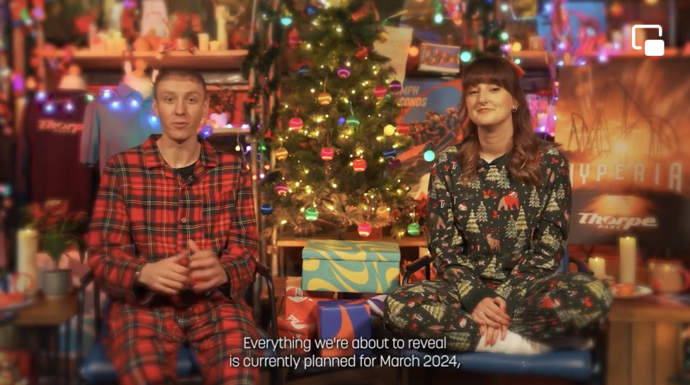
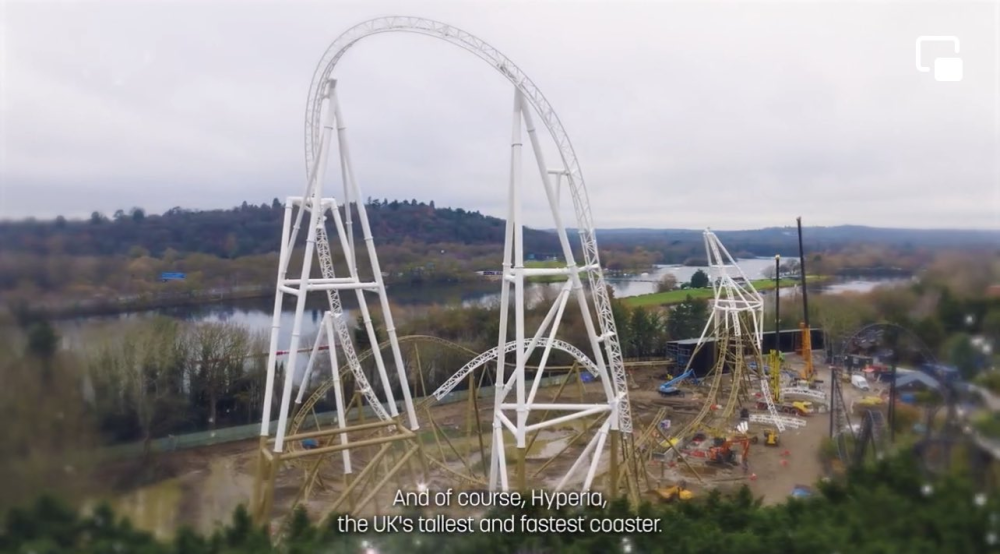
I dunno, providing that the trackwork is able to be completed by the end of this month as planned, two months of testing & training is entirely doable. The unforeseen weather delays are absolutely still a factor though - so although they mentioned that it's PLANNED for opening, that doesn't necessarily mean it will. I personally can't see it being ready for opening, but I very much feel like the park want it to be ready for opening and are doing everything they can in their power to ensure it stays on track. (It also says everything we are about to reveal is currently planned for March 2024 😉)
-
Hyperia Speculation and Construction Thread
Just like to remind everyone that this was mentioned in the Project Sparkle video on Christmas Day... 👀
-
-
New Logo Discussion
New logo reveal at 7:30 on Thursday! The park have announced that there will be a new YouTube video talking about the past, present and future of Thorpe Park branding at 7:30pm every night for the next three nights. Predictions?


