
Leaderboard
Popular Content
Showing content with the highest reputation on 08/25/25 in all areas
-
1 point
-
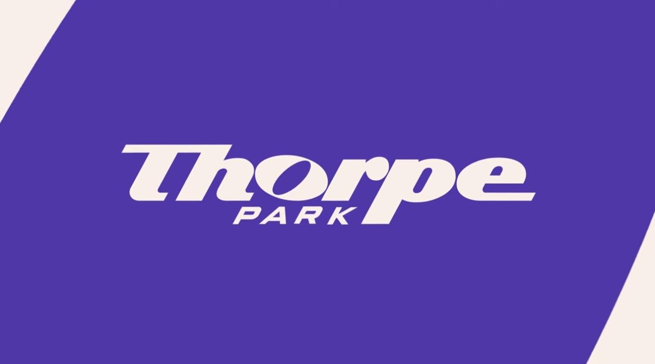
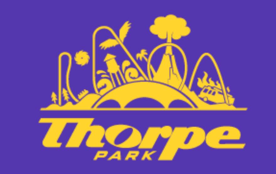
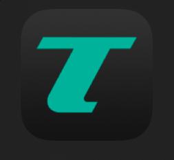
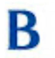
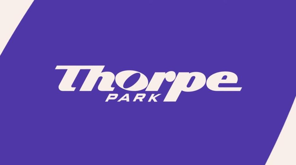
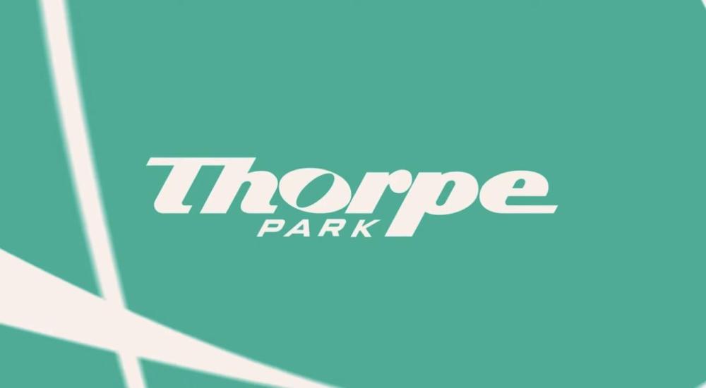
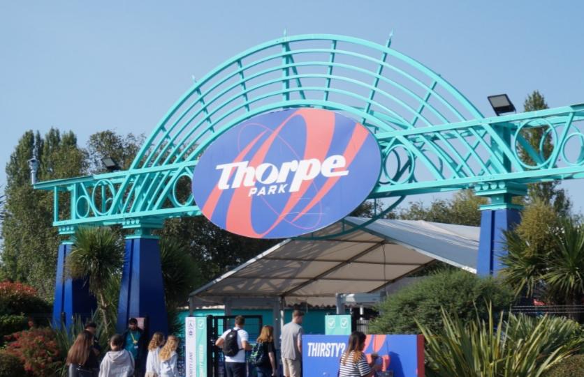
1 pointIt seems that the logo has been added to somewhat. This has made an appearance on a lot of the social media posts and marketing emails over the past couple of weeks. I have to say I’m not sure this is a step in the right direction. I know the logo has been controversial, but this busy new animated park skyline element sat on top of the existing logo doesn’t fit in with the new sleek and minimal branding. It feels a bit like an addition that’s been made as an afterthought, by someone other than the original designers of the branding. I think it’s a bit of a shame that the brand overall is already becoming muddy after just one year, and it’s being strayed from quite a lot, even with something as important as the logo. Aside from that, I’m not sure what on earth they were thinking by having this as their app icon instead of the “Thorpe” text that was there before This really bears no resemblance to the park or the brand at all. Nowhere in the branding is this standalone T referred to at all, and it isn’t an icon that’s used anywhere to symbolise Thorpe Park. imagine a brand like British Airways having this as their app icon… Ridiculous. If it’s iconic enough, like Virgin’s red V or easyJet’s lowercase orange e for example, that’s great - but BA’s B, and certainly Thorpe’s T, aren’t. Again, I think the idea behind the new TP brand design has been lost a little. I know it was controversial, but this can’t be what the designers had in mind at all. We now seem to have quite a messy crossover between the sleek and colourful branding, and efforts made by others since it was designed. I think the logo text was deliberately simple, and was always supposed to be either intertwined with the squiggly bits as shown in the reveal videos, or overlayed directly on to bold images as shown on the sample posters.

 1 point