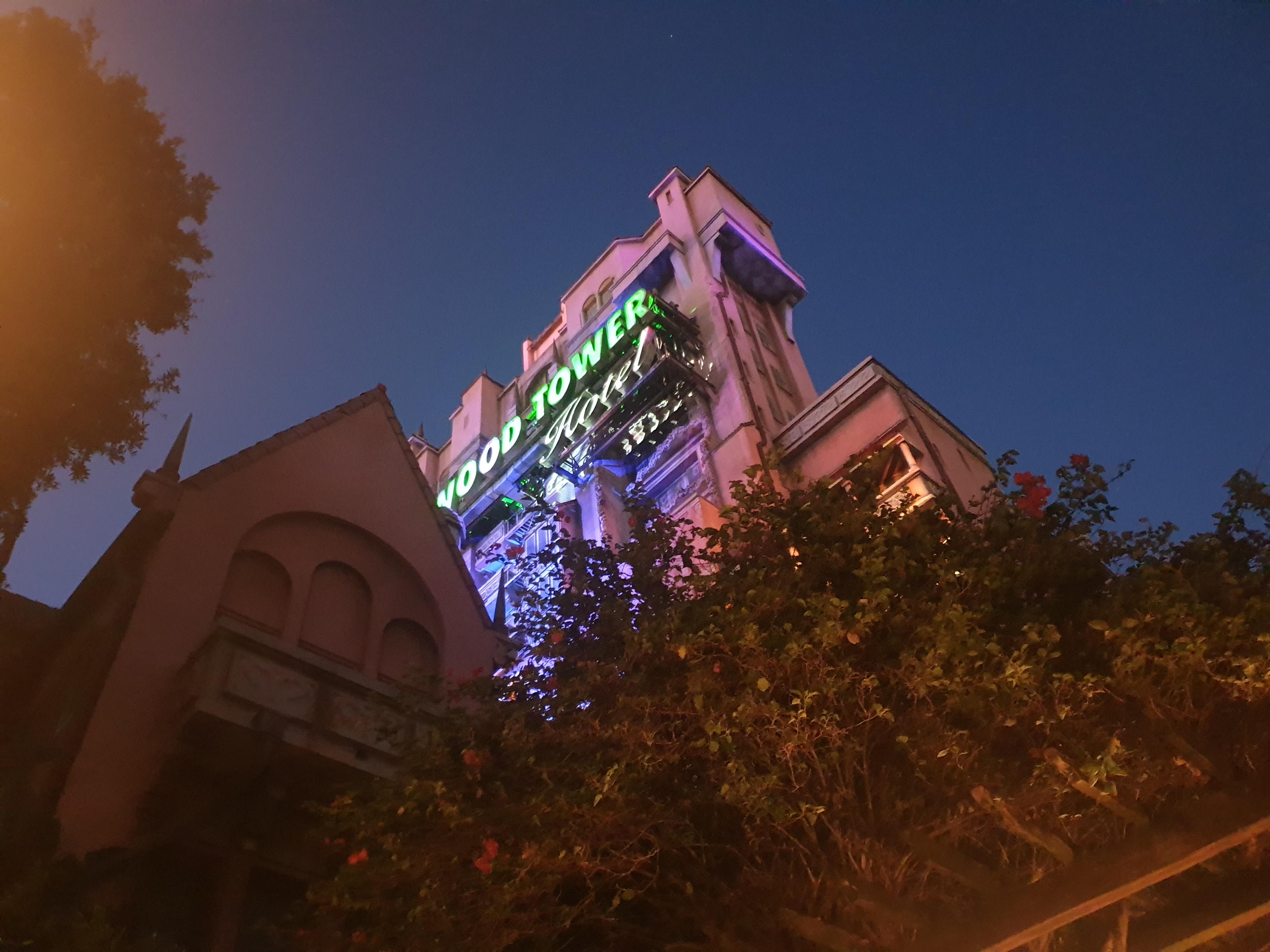
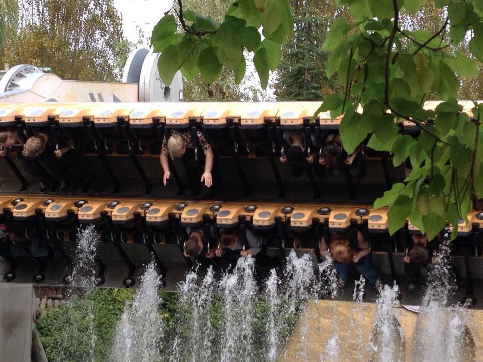
Please forgive the terrible quality screenshots taken from my phone. I'm too lazy to watch the video again.
Jack's video shows some more new signage, which compliments the new entrance signage (which looks good):
I like it! Fresh, vibrant and quite reflective of what Thorpe is really (and the sort of brand they should stick to).
And then there's this:
One of the blandest, dullest entrance ways I've ever seen.
The removal of the rockwork and other Atlantis-esque, no matter how decaying it really was, creates such a boring, flat look. The poles holding up the Dome sign feel in the way and yet invisible at the same time.
I don't know how common an opinion it is, but I liked the Atlantis theme and still think it worked with the park today (what with the Port / Basecamp / Shark vibe). Sure, it was dated and falling apart, but it had some life and soul in it. After this and the black panels of blackness on the inside, it now feels like a run-down Butlins...
Shame, as the other signage we've seen so far is good.


