


MattyMoo
Members
-
Joined
-
Last visited
Everything posted by MattyMoo
-
Going back to the grammar complaints - "would of" incorrectly used in place of "would have" (or could of/could have) seems to be the new your/you're that grinds my gears That, and the fact when I went down to Southsea beach yesterday evening for a little swim, the fact that rubbish was just left on the beach when there are bins within eyesight. Picked it up like a good citizen. People make me sick...
-
New vending machines... in a shipping container? So beautiful.
-
Prefer these to Thorpe's - but even that said, Thorpe's new ones are miles and above better than the previous scrolling LED versions
-
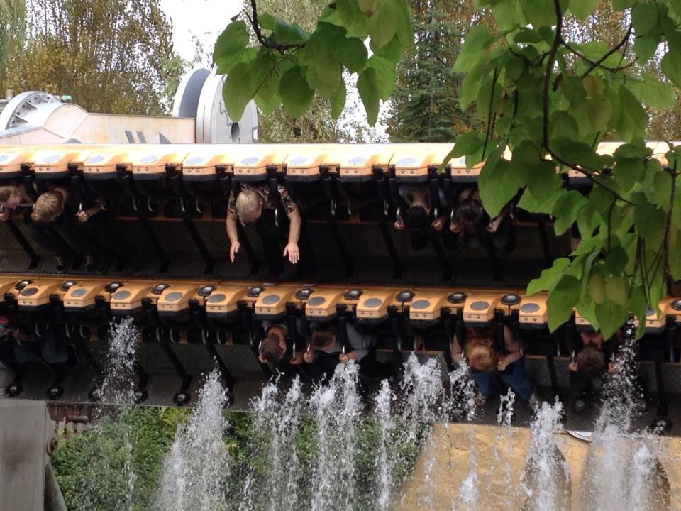
There's no doubt about it, you will get wet!
-
EXCLUSIVE: 2015 will see Rumba rethemed as Rusty Rapids, with numerous shipping containers and rusty metal scattered around the ride, and the dark section rethemed to a warehouse - who knows what rusty theming lies within! Dare you brave the orange waters of Rusty Rapids?
-
I'm sure everyone knows but Stealth station has a little countdown timer presumably as a target for quick dispatch. Any reason why Stealth has this but no other ride does? Or is it just that Stealth has the only visible timer (Saw has one too thinking about it, but that's partially for theming reasons and normally isn't synced right anyway...!)
-
The worst thing is when you see grammatical errors (normally apostrophes) on professionally made signs. I would've thought grammar and spelling would be a pre-requisite
-
To add to fastrack discussion - I've never bought one, and never would, out of principle. Kaithanxbai.
-
I did check my post many times for typos before posting
-
"Your" and "you're" are two different words. Any argument online where the wrong one is used renders said person's argument null and void
-
Right, I can't do 2nd as Becky is playing Southsea Show but I could do the 9th and stay over
-
I do quite like it too....
-
I feel your pain, fellow oldie.
-
I'll have to hold on for whenever the Paulton's trip is I think, unfortunately!
-
When do we reckon the date/destination will be decided! I don't want to double book a weekend in August 23rd & 24th weekend is a no go for us already as Becky is playing at Victorious Festival in Portsmouth
-
Just watched the video of The Roller - I think I'm about to lose my breakfast just from watching Not my cup of tea at all haha.
-
Cheeky buggers, the signs on the road said 99p for all rides
-
-
I see from Facebook photos that the "road" and curbs are still there in Angry Birds Land, with half faded single yellow line - the horror! Photos From TPM Facebook - you'll see that there is new brickwork underneath the arch to replace the road, but it's still there when you get to Detty.... and does anyone know why there are tram tracks in Amity Cove in the road - or is that theming?
-
What's going to the left and right of the big screen, folks?
-
Never mind all this - has the kerb and "road" (and yellow lines) now disappeared that were once outside Detonator and P4D? If so, then Angry Birds Land gets my 100% seal of approval. I've yet to visit, but my thoughts are: 1. I like Dodgems in theme parks personally, as they are a fun ride that are often overpriced and poorly maintained at funfairs. So I am for having them - but agree, that entrance really isn't much to write home about. (Beanoland dodgems ftw, RIP). That said, Dodgems are a nice queue eater to take people away from other rides, and all in all - I think they are a very good addition to the line up and variety of rides. 2. That Detonator retheme is epic isn't it? What a lovely sign. And a nice little reminder of the old Detty and "theme" with the old photo booth signage next to it. I'm sorry but it's these little things that really wind me - and others up - how easy is it to take down an old sign, or just paint over it? Did no-one see it there? Did no-one think that anyone else would notice or care? I mean, your eyes are going to be drawn to that big fibreglass model to the right of it, so chances are you are going to see it. 3. Big thumbs up for having the P4D cinema in use again, I'm all for SBNO rides/areas being used up. SAW Alive to be used for something more worthwhile next please 4. I wish Thorpe had splashed out on longer length new queue time boards, as much as I love them 5. I like the area entrance arches, mainly because they are tangiable, touchable, 3D structural metalwork - designers/Merlin are to be commended on those as they are true to the game and look impressive.
-
Talking of when rides will go - said it before and I'll say it again, the vast expanse of wasted land that the SAW Alive queue takes up irks me greatly considering it's only operating for a few weeks every year now.
-
Sophie didn't sign up for all this aggro
-
Put me down as a possibility on this one - it's just a bit of a mammoth trek from sunny Pompey
-
I can exclusively reveal that this extra arrangement is everyone coming to Becky and my flat in Southsea and pointing and laughing at our questionable CD collection.
